Creative Director for house of brands Creative Director for brand house Concept Naming Positioning Strategy Branding identities Package design and development Product design and development Overseas manufacturing lead Graphic Design Photography
The scene: two brothers were operating a grey market cannabis e-commerce website selling dried cannabis, vaporizers, edibles, capsules, oils and pre-rolls that they perfected in-house, but were selling their pre-rolls essentially unbranded. They wanted to build up value around a brand with legalization on the horizon, at which point I was approached and brought onboard.
As we developed more and more in-house brands, I realized we were building something much bigger — we were building a house of brands. I pitched the idea, structure, and the name, and “Shelter Cannabis” was born. Shelter thrived in the grey market and was one of the few cannabis teams to transition into the legal market.
Shelter had made a name for itself in the industry connecting people with cannabis through contract processing, route-to-market agreements and medical sales. There was a problem though: insiders knew who Shelter was, but the majority of consumers didn’t — they were consuming Shelter products through some of the biggest consumer-facing brands, but not knowing Shelter was the company responsible for the quality of goods. To become a household name and raise the value, we needed to raise the perceived value; everyone in all corners of the industry needed to know and interact with Shelter, so I made the pitch to consolidate our efforts into one overarching consumer-facing brand. Shelter went from a house of brands to a branded house and new brand architecture took form.
It was important that when different stakeholders experienced our products and services, that they would identify a consistency in quality. I translated this into a simple wordmark, followed by a suffix that represented the product and service we offered, laterally unifying Shelters’ customers. I continued the use of the house logo mark I had previously created to be used as a prominent identifier.
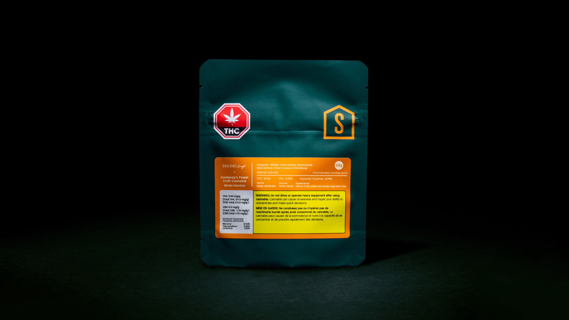
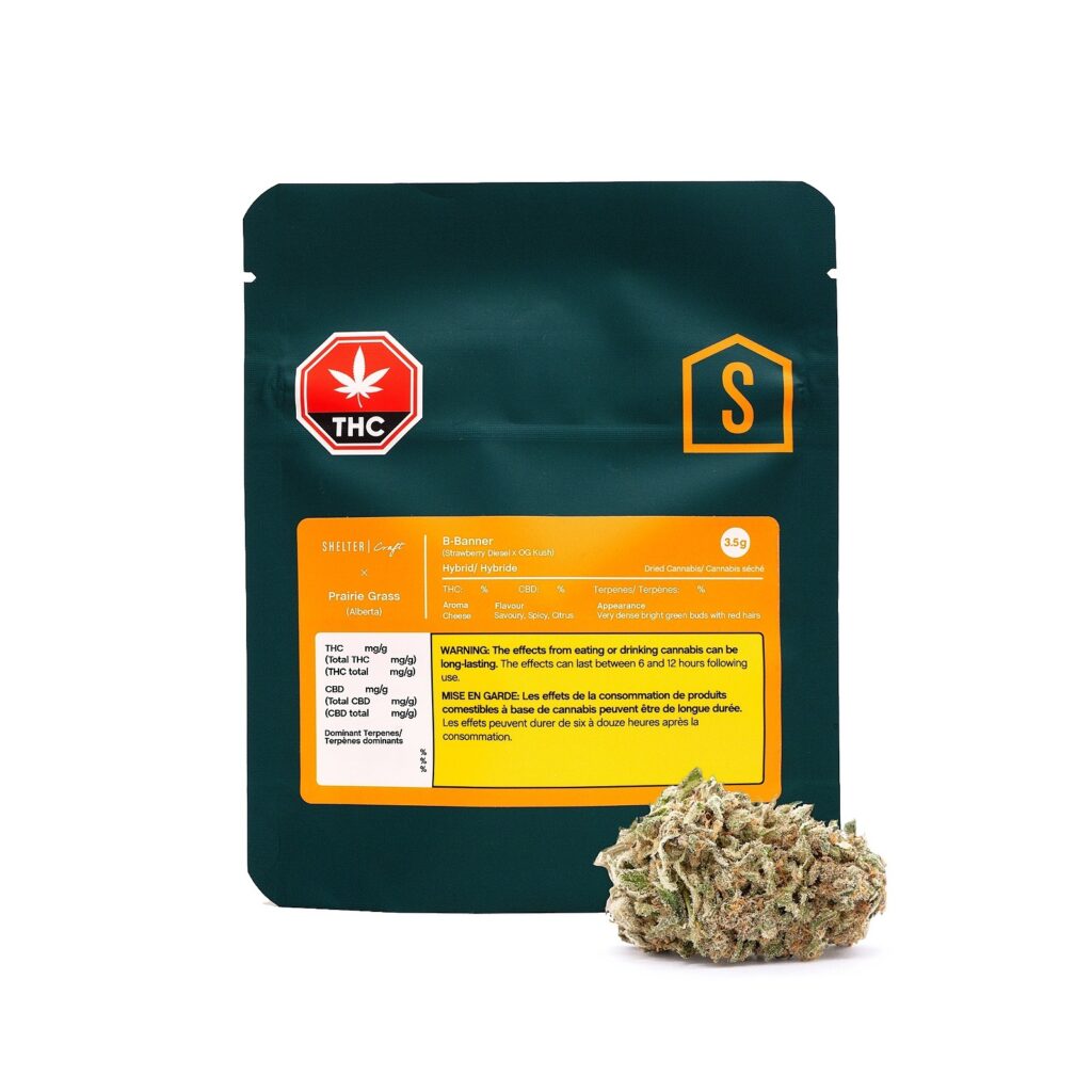
The clean wordmark and logo mark was countered with an intentionally distinctive colour palette, with a deep green representing the nature of the product, contrasted with an almost neon orange representing Shelters’ industry-disrupting attitude.
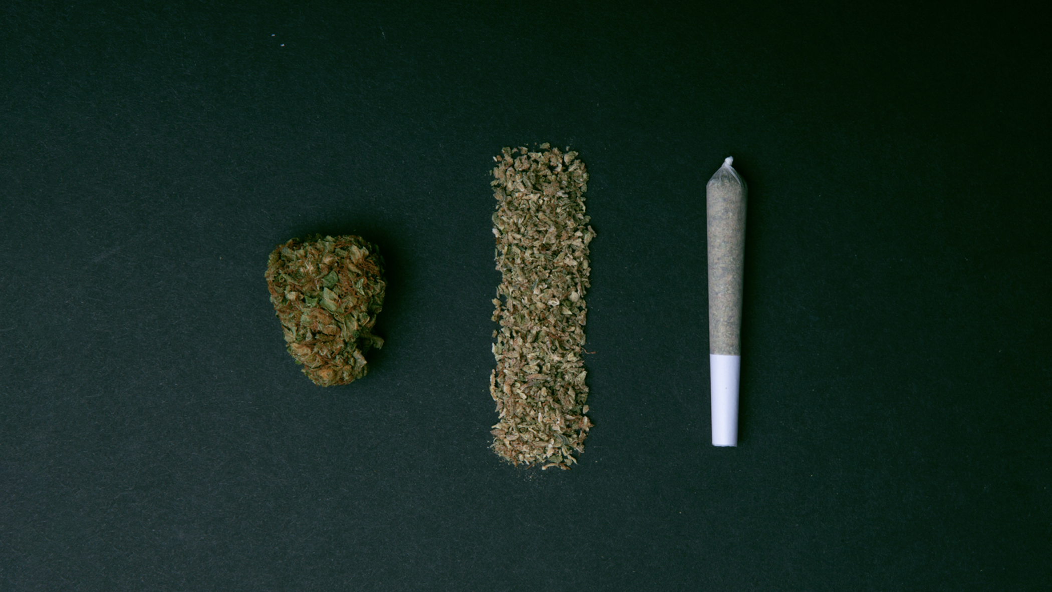
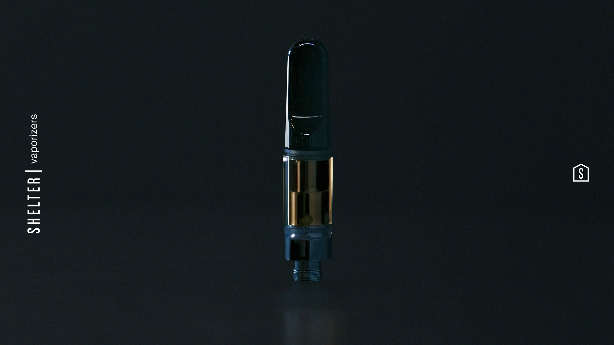
Through product experimenting and market testing, we eventually narrowed our focus onto three core product categories: dried craft cannabis, pre-rolled joints and vaporizers. Top tier products and a top tier sales team meant our packaging quality needed to match that. With cannabis packaging so heavily regulated, the goal was to break free from the limitations, without breaking the regulations.
Through a team effort, Shelter changed the game.
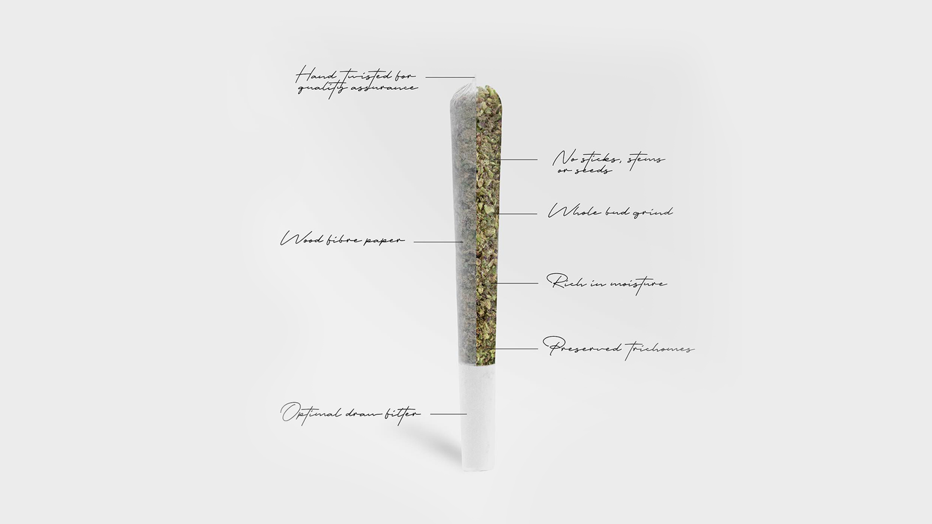
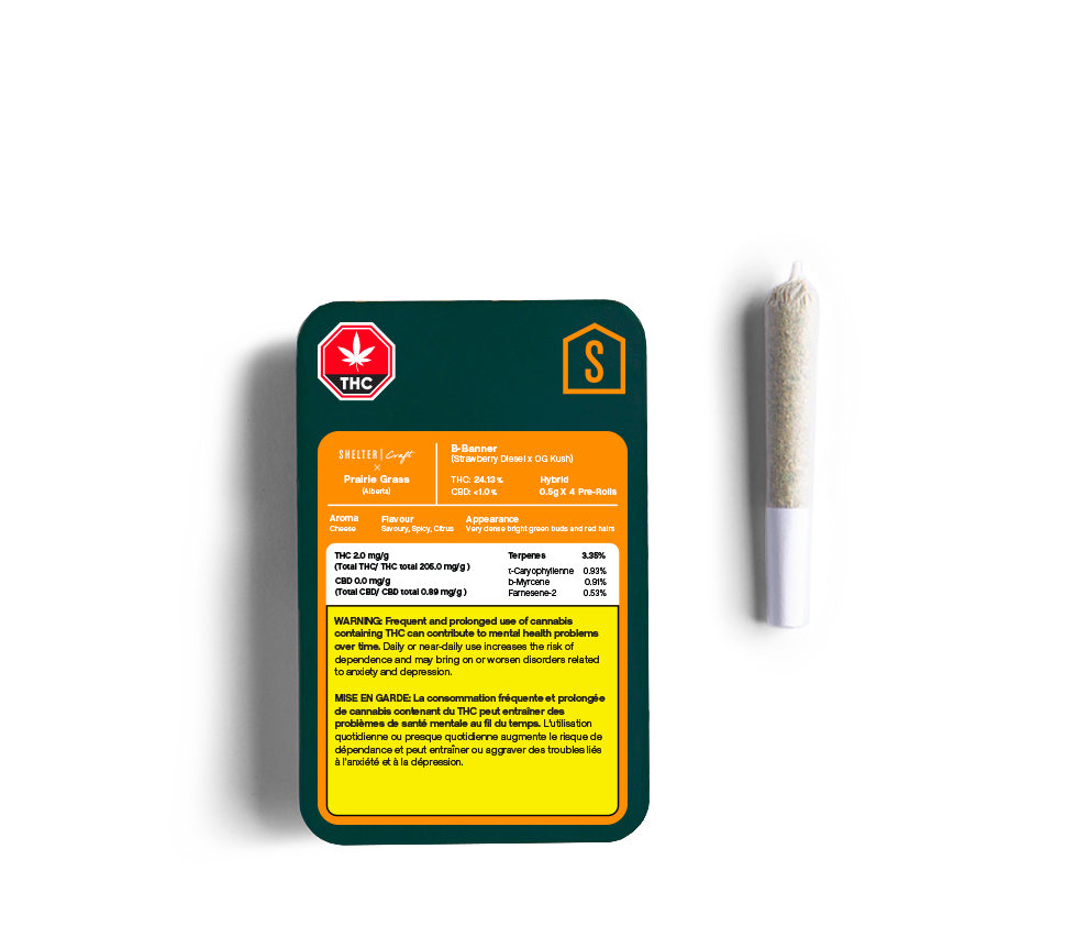
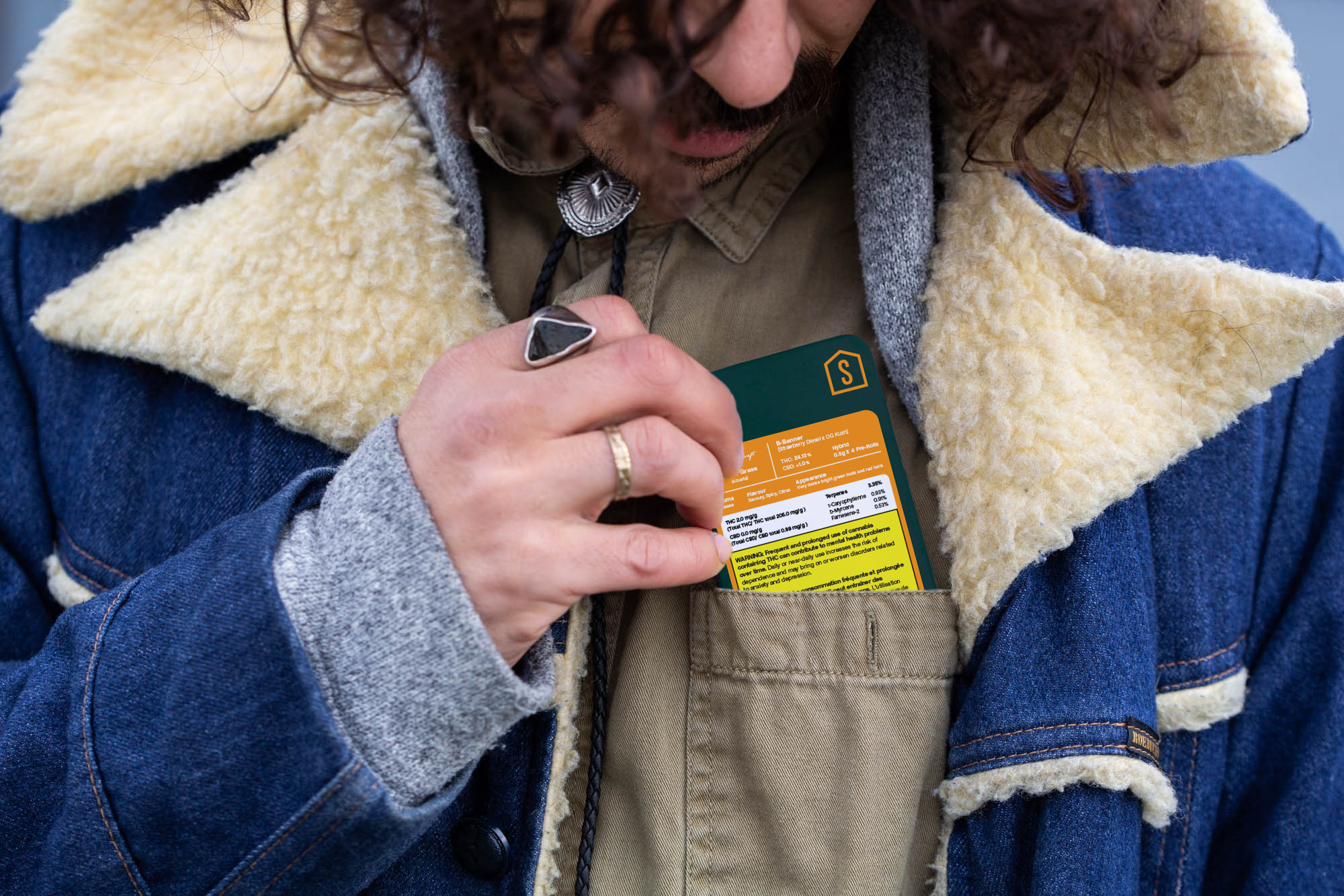
Cannabis packaging needs to meet compliance and Health Canada not leaving any room for anything non-essential on the package is an understatement. I turned my attention to packaging size. My core focus with our pre-rolls was “pocket-friendly packaging”: small enough to comfortably fit into your front pants pocket, durable, recyclable, and childproof, but there was nothing turnkey on the market that met that criteria. With development of paper-based packaging underway overseas, it was a chance encounter at Canadian tradeshow introduction that offered the solution that forever changed Shelters’ trajectory: the tin.
Shelters’ combination of the pre-roll tin and inserts were created and signed with Canada-wide exclusivity rights.
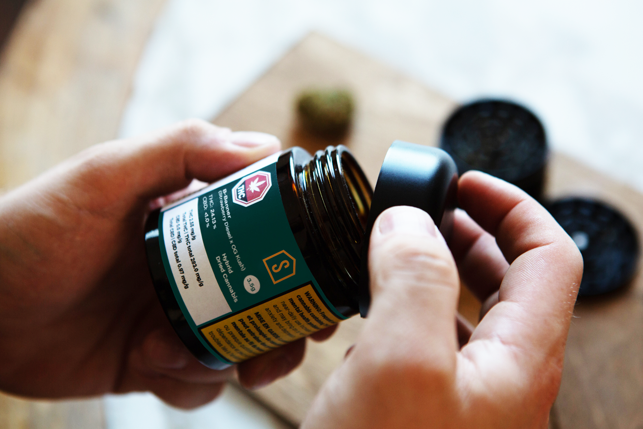
Amber jars reign supreme in the world of dried cannabis, so they were a natural initial choice to use for our 3.5 grams format. We sourced a heavy bottomed jar with a beveled lid for the feeling of substance and quality when held in hand. While receiving some praise amongst cannabis enthusiasts, we needed another solution as the compounding costs put our product outside of our comfortable MSRP. The decision to switch to a mylar bag set a new standard, winning the hearts of consumers and threatening the competition simultaneously.
My intent was to create the perfectly-sized packaging to fit an exact 3.5 grams of cannabis to combat over-packaging in the cannabis industry. Through multiple rounds of hand made paper and super glue prototypes, I got the perfect sized locked in.For the production I rounded the corners for a more approachable look, and a soft matte finish for a quality feel.
While most cannabis packaging only includes the required information, my brief included a lengthy amount of unrequired information; unrequired and information no cannabis company has ever put on their label, but of value to the serious cannabis user.
I grouped the information into two labels: the front displayed all the information to trigger a sale; the back label efficiently provided clear and direct cannabis information. My intention was to create an industry standard approach to full cannabinoid profiles, cultivar facts, farm facts, grow facts and harvest facts. This packaging and level of transparency would go on to be the new set standard.